Creative Processes Behind a ui ux design agency pune for Engaging Digital Experiences
Why do engaging digital experiences begin with a clear user problem?
Creative digital work becomes effective when it starts with a real user problem, not a decorative screen. A ui ux design agency pune can help teams translate unclear business goals into simple journeys that people understand quickly. The strongest process first asks what users need to accomplish, where they struggle, and what prevents completion. This approach also keeps design decisions connected to measurable outcomes such as successful enquiries, faster task completion, or fewer support requests.
Start with evidence before ideas
Before choosing colours or layouts, review customer conversations, search behaviour, analytics, support tickets, and existing product feedback. For a regional business, consider smaller screens, variable network quality, multilingual expectations, and trust concerns when users share personal information. Then define one primary task for each important screen.
- Describe the user, situation, and desired outcome.
- List the business constraint affecting that outcome.
- Separate observed problems from internal assumptions.
- Set a practical measure for improvement.
This foundation prevents attractive but unsuitable features from taking over the project. It also gives stakeholders a common reference when priorities change during planning.
How does research shape a practical design direction?
Research gives a design team enough context to make decisions with confidence. Instead of guessing what customers prefer, the team studies how people currently complete tasks and where confusion appears. Interviews, short surveys, competitor reviews, and product data each reveal different parts of the experience. Together, they show whether the main issue is poor wording, complicated navigation, missing information, slow interaction, or a lack of confidence.
Use lightweight research with a focused purpose
Research does not need to become an endless exercise. A focused plan can answer the most important questions before visual design begins. For businesses serving Maharashtra, conversations with users from cities and smaller towns may reveal different device habits, language preferences, and expectations about support.
- Recruit participants who represent actual customer groups.
- Ask about recent behaviour instead of hypothetical opinions.
- Record repeated obstacles and emotional concerns.
- Compare findings with analytics and service data.
- Convert findings into design principles and priorities.
A useful research output is a short evidence summary. It should explain what users are trying to do, why they fail, and which improvement deserves attention first. This keeps later discussions practical and reduces personal preference from controlling the outcome.
What makes information architecture easy to understand?
Information architecture decides how content, functions, and screens fit together. When it is strong, users can predict where to find information and what will happen after each action. When it is weak, even polished interfaces feel difficult because people must repeatedly search, backtrack, or interpret unfamiliar labels. A good structure reflects the user’s mental model rather than the organisation’s internal departments.
Organise around tasks and relationships
Begin by grouping content according to user goals. For an ERP or business portal, this may mean separating daily operations, reports, approvals, settings, and account information. For a public website, users may need clear paths for understanding an offering, checking proof, comparing options, and contacting the team. Card sorting and tree testing can validate labels before development starts.
- Use familiar words for navigation items.
- Keep related actions close together.
- Show the current location within deeper journeys.
- Limit competing calls to action on one screen.
- Plan empty, loading, success, and error states.
Consistent architecture also supports search visibility and accessibility because meaningful headings and logical order help people and assistive tools interpret the interface. The structure should remain useful as the product grows.
How do wireframes and prototypes reduce design risk?
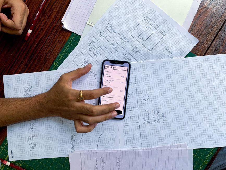
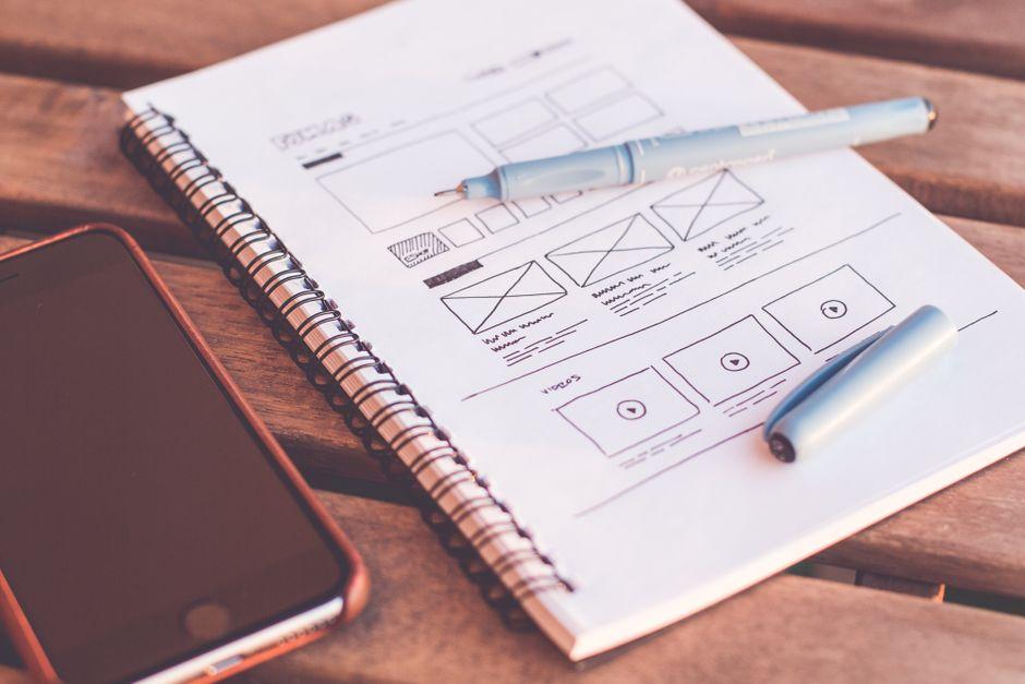
Wireframes turn a broad idea into a testable arrangement before teams spend time on detailed visuals. They show hierarchy, content priority, interaction flow, and likely edge cases without distracting stakeholders with final colours or imagery. Prototypes then add enough behaviour for people to experience the journey. This makes hidden problems visible while changes are still affordable.
Test the journey before polishing the surface
A practical prototype should cover the most important path, such as registering, searching, submitting a request, approving an item, or completing payment. It should also represent interruptions, including missing fields, invalid entries, cancelled actions, and slow responses. For mobile users, test thumb reach, keyboard behaviour, and screen transitions.
- Sketch the main task in low-fidelity wireframes.
- Connect screens into a realistic clickable flow.
- Ask representative users to complete specific tasks.
- Note hesitation, errors, questions, and workarounds.
- Revise the flow before detailed interface production.
Prototypes are especially valuable for custom software because different departments may interpret the same workflow differently. They create a shared model for business owners, designers, developers, and future users, improving alignment before implementation begins.
Which visual design choices improve clarity and trust?
Visual design should make important information easy to notice and actions easy to understand. It is not only about selecting an attractive colour palette. Typography, spacing, contrast, imagery, icons, and component behaviour must work together as a predictable system. A reliable interface feels calm because users do not need to decode every screen from the beginning.
Build a consistent interface system
Start with accessible text sizes, readable line lengths, sufficient contrast, and clear focus states. Use colour to support meaning, not as the only signal for errors or status. Buttons should look interactive, while headings should clearly separate levels of information. For Indian audiences, familiar payment patterns, recognisable trust signals, and transparent contact details can reduce uncertainty.
- Define type styles for headings, body text, labels, and help text.
- Create spacing rules that support visual grouping.
- Use a limited set of purposeful colours.
- Design reusable components for repeated patterns.
- Prepare responsive states for common screen sizes.
A design system helps teams maintain quality as screens multiply. It also improves development handoff because the team can refer to shared rules rather than interpret every page separately. The result is a more coherent experience across websites, dashboards, and applications.
How should teams design for accessibility and local behaviour?
Accessible design helps more people complete tasks independently, while local awareness makes an experience feel relevant and dependable. Both should be considered early rather than added after launch. A usable interface supports different abilities, devices, connectivity conditions, languages, and levels of digital confidence. These considerations are important for products used across Maharashtra and other diverse Indian markets.
Include practical conditions in design decisions
Check keyboard access, screen-reader labels, focus order, contrast, text resizing, error recovery, and touch target size. Keep important content available when images fail or connectivity is weak. If Marathi or another regional language may be needed, allow enough space for longer labels and test translated layouts before finalising components.
- Provide meaningful labels for form fields and controls.
- Explain errors in plain language with a recovery step.
- Avoid relying on colour, sound, or motion alone.
- Design for responsive use on affordable mobile devices.
- Protect personal data through clear consent and privacy messaging.
Accessibility reviews, device testing, and real user observation reveal issues that desktop-only reviews miss. A useful process treats inclusion as a quality standard, not a separate compliance task.
What should happen when design moves into development?
Strong design can lose value if the development handoff is incomplete. Designers and developers need a shared understanding of behaviour, content, technical limits, and quality expectations. Collaboration should begin while flows are being shaped, because technical feedback can prevent unrealistic interactions and expensive rework. The goal is not to make design secondary, but to make the final product accurate and dependable.
Create a clear handoff and review rhythm
Document component states, responsive behaviour, validation rules, loading patterns, accessibility requirements, and content assumptions. Keep decisions in one accessible workspace so changes remain traceable. During implementation, review working screens rather than relying only on static files. This is useful for products involving APIs, cloud services, dashboards, or multiple user roles.
- Agree on supported browsers, devices, and breakpoints.
- Define reusable components and their allowed variations.
- Record interaction rules for normal and unusual states.
- Review early builds with design and engineering together.
- Track defects by user impact and release priority.
RavenByte Solutions can support this type of coordinated work when a business needs design connected with web applications, ERP systems, SaaS products, or secure software delivery. Even then, the process should remain guided by user outcomes rather than technology alone.
Which common design mistakes make digital products harder to use?
Many disappointing experiences come from small decisions repeated across a product. Teams may add too many features, hide important information, or assume that users understand internal terminology. Sometimes a design looks successful in a presentation but fails during real use because it ignores interruptions, errors, accessibility, or mobile conditions. Recognising these patterns early helps protect time and budget.
Check quality beyond visual appearance
Review every important journey from the perspective of a first-time user. Ask whether the next action is obvious, whether the value is clear, and whether a mistake can be corrected without starting again. Also compare the designed experience with the actual implemented screen, since small differences can affect trust and task completion.
- Do not begin with decoration before defining the user task.
- Do not copy competitor patterns without understanding their context.
- Do not hide fees, permissions, limits, or important conditions.
- Do not treat desktop layouts as automatically suitable for mobile.
- Do not skip testing because internal reviewers understand the product.
For local businesses, another risk is assuming every customer has the same language, connectivity, or device. A short usability review with varied participants can expose these gaps. Fixing high-impact problems before launch is usually more valuable than adding another visual feature.
How can a business plan the next stage of product design?
The next step is to turn design learning into a practical delivery plan. Begin with the user journey that has the greatest business value and the clearest evidence of difficulty. Then define the smallest useful release, the research still required, and the quality checks that must happen before launch. This approach creates momentum without treating the first release as the final answer.
Prepare a decision-ready design brief
A good brief explains the audience, problem, business outcome, key tasks, technical environment, content needs, accessibility expectations, and timeline constraints. Businesses seeking a UI UX design company in Chhatrapati Sambhajinagar may also consider local availability for workshops, feedback sessions, and ongoing collaboration. For broader regional work, user experience design services in Maharashtra can help teams account for varied markets and usage conditions.
- Prioritise one high-value journey for initial validation.
- List required integrations, data sources, and security concerns.
- Define approval owners and feedback deadlines.
- Plan usability testing before and after implementation.
- Set post-launch measures for learning and improvement.
When specialist guidance is needed, product design consultation in Pune can help clarify scope, research priorities, and delivery choices. RavenByte Solutions is located at Golden city, beside Prozon Mall, Cidco, Chhatrapati Sambhajinagar, Maharashtra 431006, and can be considered as a local technology partner for connected product work.
Need Professional Assistance?
Speak with our experts today and get reliable guidance tailored to your requirements.
Call Now